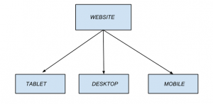
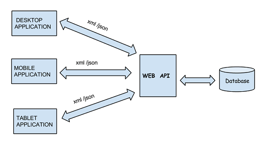
Websites today are accessed from many different types of devices.So unlike the web applications of the past which were accessed mainly from the desktop browser ,web applications of today needs to be designed considering how the web site will appear and work on different devices and screen sizes.
While considering mobile device support ,”user agent” is an important browser setting to consider.Websites determine the browser and the device the browser is running on using the user agent setting.Our website can easily determine the type of the device or platform on which browser is running and then return the appropriate HTML and css.
For example a mobile device has a smaller screen size than a desktop.The navigation and user input controls which works well on a desktop might not be user friendly on a mobile device.
So it is the responsibility of our website to generate web pages which the user can access easily on the device he is using making the request.Fortunately MVC supports creating such applications.
MVC provides support for creating web sites which target different devices.We can uses HTML5 and CSS3 features for creating multitargeted sites.Although we can create applications which target different types of devices such as iOS and Windows ,this requires learning native application development for different platforms.So using MVC we can create one site which targets different devices instead of creating separate applications for different platforms.
Two important ways which we can use to develop MVC applications targeting different devices are:
1.Adaptive rendering This means the website is displayed differently depending on the device making the request.For example we can apply different styles depending on the device making the request.
2.Display Modes Unlike adaptive rendering in which we change the style based on the browser making the request using Display Modes we can send completely different markup based on the browser.This uses convention based approach to select the mobile views.
Adaptive Rendering
This uses two important concepts
ViewPort Meta tag Viewport meta tag is an important part of creating cross device website or a website that is flexible enough to work on different devices.
To understand the use of viewport we need to think what happens when we request a web page from a mobile device.
The browser on the mobile device assumes that we are making a request from a desktop and wants to see entire page at a time ,as will be the case when we make the request from the desktop browser.That is why the page displayed may not be much readable on a mobile device and needs to be zoomed in and out if our web site doesn’t support mobile devices.
We can specify to the browser the size we want it to use to display our page using the ViewPort Meta tag.So user can read our page on the mobile device browser without zooming in and out.We can specify the width using the ViewPort meta tag as
<meta name="viewport" content="width=device-width">
CSS Media Queries CSS media queries are a feature of CSS3 and defines the scope of the css style by using media features such as width and height.Media queries consists of expressions which are evaluated to true or false.So the style will be applied only if the expression evaluates to true.
For example using CSS media queries we can specify a css rule which will be applied only if the screen size falls within a certain range.The following css query will be applied only when device screen size is less than 600px ,which is usual for mobile devices.
@media only screen and (max-width: 600px) {
 .header {
 display: none;
 }
}
Display Modes
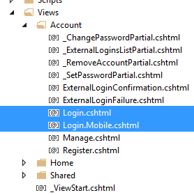
We can create different versions of the views to render on different devices.For example we can create one view for a desktop browser and another view for a mobile browser.
So if we request the Login view from a mobile device then Login.Mobile.cshtml view will be rendered while if we make the request from a desktop browser then the Login.cshtml view will be rendered.The appropriate view is selected by the MVC framework using the convention that the view with “.Mobile” suffix will be used to serve the request to a mobile browser.
This feature gives us a lot of flexibility as we can design the view specific to a mobile device.For example we can create a view specific to iOS or Android.
We can set displaymode for devices in the global.asax ,at application startup.So we can set the display modes for windows phone and iphone as
windows phone
DisplayModeProvider.Instance.Modes.Insert(1, new DefaultDisplayMode("WP")
{
ContextCondition = (ctx => ctx.GetOverriddenUserAgent()
.IndexOf("Windows Phone OS", StringComparison.OrdinalIgnoreCase) > 0)
});
iphone
DisplayModeProvider.Instance.Modes.Insert(1, new DefaultDisplayMode("iPhone")
{
ContextCondition = (ctx => ctx.GetOverriddenUserAgent()
.IndexOf("iPhone", StringComparison.OrdinalIgnoreCase) > 0)
});
Now if we add the different views for windows and iphone,we just need to suffix the proper string and the appropriate view will be rendered depending upon the client’s OS.
- Login.WP.cshtml for windows OS
- Login.Android.cshtml for android OS.
Bootstrap framework
There is bootstrap framework available in MVC applications which helps us create responsive web applications.Responsive web applications are those which adjusts their style based on the clients viewport.Since MVC applications using bootstrap framework are responsive web applications so they adjust their layout depending on the client.
So as we have seen ASP.NET MVC Mobile Features helps it easy to create web sites which works efficiently on different devices.
